Design drama was in the air on Inauguration Day when President Barak Obama entered the White House and assumed control of the United States government website.
Obama’s masterful use of social media technology during the election campaign heightened expectation that he would flip a switch and reveal a new design.
Not surprisingly, a dramatically redesigned site appeared on the Internet immediately after Obama became president.
Information design was overhauled as well.
For example, under the term “Your Government” the Bush home page linked to pages entitled “The President’s Cabinet”, “USA Freedom Corps” and “Faith Based & Community Initiatives”.
The Obama home page, on the other hand, uses the term “Our Government” and links to pages entitled “The Executive Branch”, The Legislative Branch”, The Judicial Branch” and “The Constitution”.
For many the Obama page appears fresh and light, as if it were designed to reflect the principles of transparency and hope that were the touchstones of his campaign. Others see the page differently but there is no denying that people all over the world noticed the change.
George Spencer, a computer programmer living in Halifax, Nova Scotia, said the new web site “has a modern, elegant, open feel.”
“It is more modern and highlights the government’s intentions and achievements. It’s easy to pick out something of interest. The links along the top of the page seem to be oriented toward educating the public – something I suspect is a priority, in the larger sense, for the Democrats,” he said.
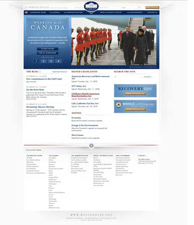
People responded to the redesign with artistic savvy as well as political concern. Christine Gengaro, a music teacher at Los Angeles City College in California said, “It’s striking to see how much more visually stimulating the Obama page is. It’s like someone actually designed it. It’s very savvy because it doesn’t overwhelm you with text, the way Bush’s page does. There are plenty of links if you’re interested in something, and the lead story has a beautiful photograph and really draws in the eye.”
Tom Goulter, a film editor living in Wellington New Zealand, said, “Descriptive is very much what the Bush website was. Clunky and full of styles and tones that date the site firmly to the era it represents. It’s got a tinny, try hard tone to it, as if someone’s nephew was asked to look at what people were doing on the Internet and just ape that as transparently as possible, so as to provide a quick, unobtrusive front for Government information dispersal.”
Michele Wang, a technology trainer living in New York City saw the page in the context of design trends. “The three column layout of Bush’s is very dot com era design. I like Obama’s slideshow feel right at the top and then essential links at the bottom. With only that one piece of real estate on the page, you can flip to three other features which are definitely more sophisticated,” she said.
K. Andrews, a lawyer living in Ottawa, Canada, saw historical significance in the photograph of Obama with the Royal Canadian Mounted Police.
“President Obama’s home page is definitely catchier because of its focus, clean lines and deep blue colour in contrast with the Scarlet uniforms of the Mounted Police, “ Andrews said.
“The last time a U.S. President got this close to the Scarlet may have been when British and Canadian marines were burning the White House down during the War of 1812.”
Jesslyn Hendrix, business analyst in Los Angeles, California noticed the sudden presence of Spanish on the White House website. “I find it telling that although the Bush administration touted its support for and relationship with our southern border neighbors, only the Obama page has a link to the Spanish translation of the site,” Hendrix said.
After Obama’s design was revealed people began to see shortcomings in the Bush design.
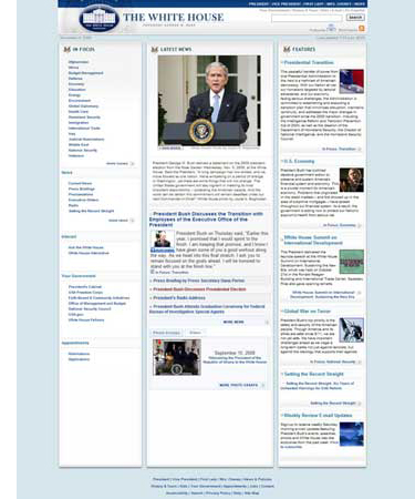
“Overall it looks as if Bush hired an old school PC neocon contractor to do his website and Obama hired some hip Mac web designer that deejays on the weekend,” said Michael Rouse, a filmmaker in Vancouver, British Columbia.
Hendrix said that the Bush home page conveyed a sense of “we’ve got to have a web page because everyone else is doing it.”
Not everyone has been totally convinced of the integrity of the Obama design, however.
Goulter feels that “The script/serif juxtaposition and subtle gradients make it look a little bit more like the web page for a West Wing type movie or television program than the actual website of the real centre of power in the West. It’s like too much work has been done to imbue the fonts with vaguely playful dignity and the colors with a deep, reassuring solidity. It feels like a lovingly-crafted fiction, prescriptive of what the administration aims to embody rather than simply descriptive of what it is.”
Andrews mixed praise for Obama’s website with skepticism of his politics.
“The new website wins hands down based on form over substance. This conclusion should not be taken to mean that President Obama’s policies and actions also have more form than substance, as this may or may not be the case,” he said.




Hey, Michael,
This looks cool. Nice job.
Cheers,
Mike